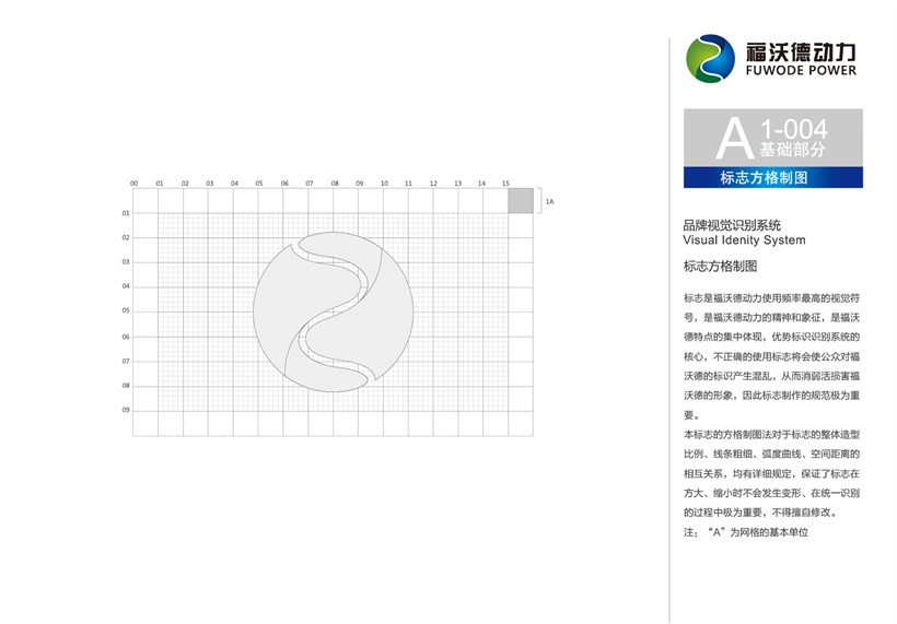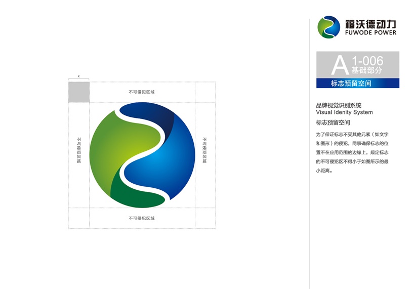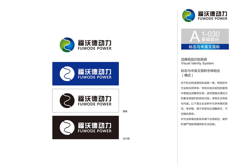
The "F" shaped taiji fish in LOGO is evolved from the figure of the striker who symbolizes the shot. It is also the first letter of the English word for the Forward (forward), which means that the company is brave and aggressive, and actively attacks the market. spirit.
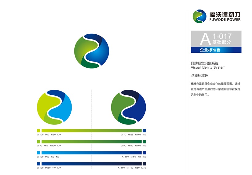
LOGO consists of two colors, located in the blue color on the right side of the logo, which symbolizes the company's profound research and development, and also symbolizes the company's relying on science and technology to provide continuous support and motivation for the products. The green color on the left side of the logo symbolizes that the company can provide customers with energetic products, meaning that the company's products will always be alive and well.
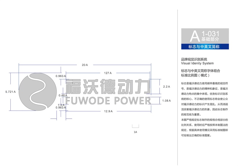
The LOGO appearance consists of a circular and taiji pattern that symbolizes the motor core. The overall appearance is like the earth overlooking in space. The blue ocean is accompanied by the green earth, which symbolizes the efficient and environmentally friendly products of Forward. It is also taken by Forward's homophonic FOR WORLD (for the world), symbolizing Foward. Products will serve the lofty ideals of users around the world.
